 サイトマップ
順送りセンター表示..次は収納3工程...
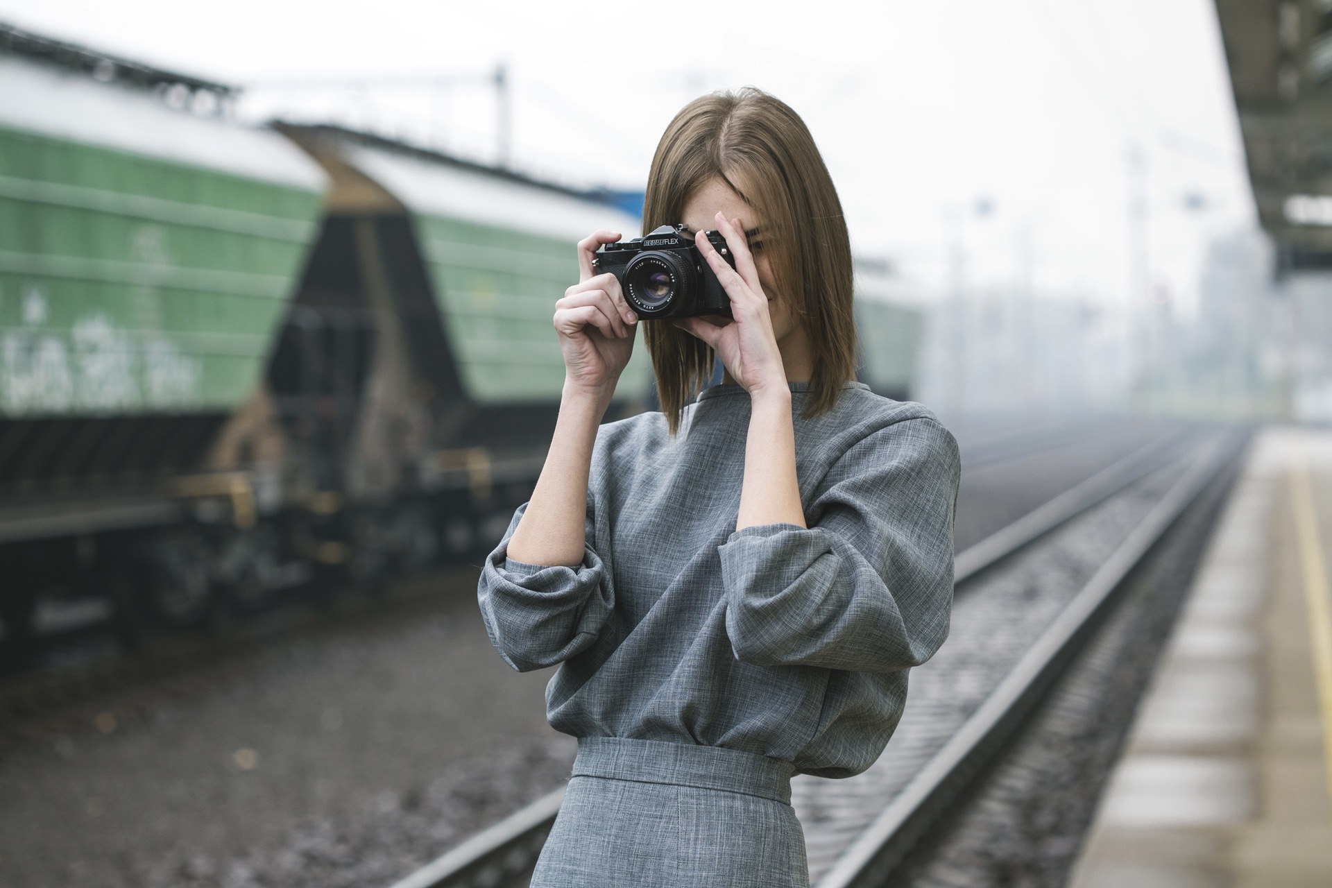
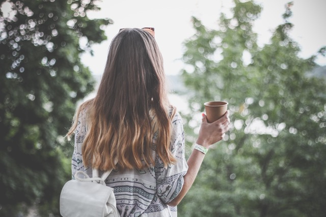
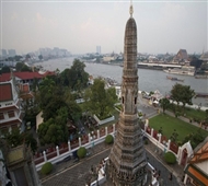
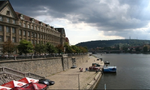
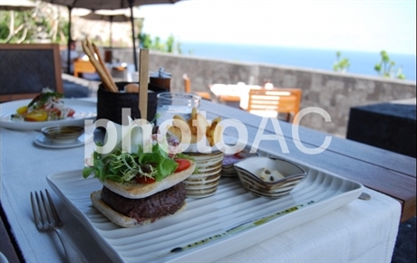
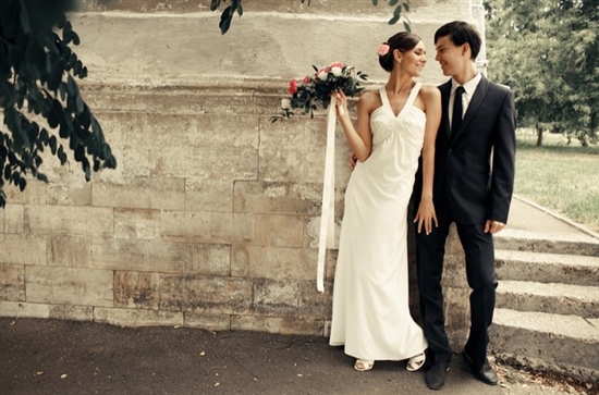
記事内中央で右から順に送り出されるサムネイル画像がセンター表示する
トップページやかてごりーPでイメージに合う画像を取り揃えて表示すると
とても面白い...と自己解釈しています
表示背景は、サイトイメージに合わせて色替えできますので、個々の事情に
合わせてお使いください
イメージ仕様

記事内HTMl...画像コード配置.. 6枚用意....サイズ指定は必須
折れてますので、コピーして記事内貼り付け後、書き換えてください
<div id="stage1">
<div id="photo1" class="photo"><img src="<% pageDepth %>img/w1.jpg" style="height:300px;width:300px;" alt="" /></div>
<div id="photo2" class="photo"><img src="<% pageDepth %>img/w2.jpg" style="height:300px;width:300px;" alt="" /></div>
<div id="photo3" class="photo"><img src="<% pageDepth %>img/w3.jpg" style="height:300px;width:300px;" alt="" /></div>
<div id="photo4" class="photo"><img src="<% pageDepth %>img/w4.jpg" style="height:300px;width:300px;" alt="" /></div>
<div id="photo5" class="photo"><img src="<% pageDepth %>img/w5.jpg" style="height:300px;width:300px;" alt="" /></div>
<div id="photo6" class="photo"><img src="<% pageDepth %>img/w6.jpg" style="height:300px;width:300px;" alt="" /></div>
</div>
次は....スタイルシートCSS記載...
さほどの変更はしなくともよいかと...
背景仕様は、表示領域 で行ってください
/* 表示する領域 */
#stage1 {
position:relative;
width: 600px; /* 背景横サイズ */
height: 400px; /* 背景縦サイズ */
background: #333; /* 背景カラーはここ書き換え */
overflow:hidden;
}
/* スライド共通 */
.photo {
position: absolute;
left: 150px;top:50px;
border:#fff 2px solid;
z-index:-1;
}
/* 各スライドのanimation設定 */
#photo1 {
-webkit-animation:slidepass 18s infinite;
-webkit-animation-delay:-9s;
animation:slidepass 18s infinite;
animation-delay:-9s;
}
#photo2 {
-webkit-animation:slidepass 18s infinite;
-webkit-animation-delay:-6s;
animation:slidepass 18s infinite;
animation-delay:-6s;
}
#photo3 {
-webkit-animation:slidepass 18s infinite;
-webkit-animation-delay:-3s;
animation:slidepass 18s infinite;
animation-delay:-3s;
}
#photo4 {
-webkit-animation:slidepass 18s infinite;
-webkit-animation-delay:-0s;
animation:slidepass 18s infinite;
animation-delay:0s;
}
#photo5 {
-webkit-animation:slidepass 18s infinite;
-webkit-animation-delay:3s;
animation:slidepass 18s infinite;
animation-delay:3s;
}
#photo6 {
-webkit-animation:slidepass 18s infinite;
-webkit-animation-delay:6s;
animation:slidepass 18s infinite;
animation-delay:6s;
}
/* スライドの動きワンサイクル */
@-webkit-keyframes slidepass {
0% {-webkit-transform:perspective(1000px) rotateY(-95deg) translateZ(-300px);z-index:11;}
10% {-webkit-transform:perspective(1000px) rotateY(-95deg) translateZ(-240px);z-index:12;}
16.7% {-webkit-transform:perspective(1000px) rotateY(-95deg) translateZ(-240px);z-index:12;}
26.7% {-webkit-transform:perspective(1000px) rotateY(-90deg) translateZ(-200px);z-index:13}
33.3% {-webkit-transform:perspective(1000px) rotateY(-90deg) translateZ(-200px);z-index:13}
43.3% {-webkit-transform:perspective(1000px) rotateY(0deg) translateZ(0px);z-index:14;}
50% {-webkit-transform:perspective(1000px) rotateY(0deg) translateZ(0px);z-index:14;}
60% {-webkit-transform:perspective(1000px) rotateY(90deg) translateZ(-200px);z-index:17;}
66.7% {-webkit-transform:perspective(1000px) rotateY(90deg) translateZ(-200px);z-index:17;}
76.7% {-webkit-transform:perspective(1000px) rotateY(95deg) translateZ(-240px);z-index:15;}
83.4% {-webkit-transform:perspective(1000px) rotateY(95deg) translateZ(-240px);z-index:15;}
93.7% {-webkit-transform:perspective(1000px) rotateY(95deg) translateZ(-300px);z-index:11}
100% {-webkit-transform:perspective(1000px) rotateY(95deg) translateZ(-300px);z-index:11}
}
@keyframes slidepass {
0% {transform:perspective(1000px) rotateY(-95deg) translateZ(-300px);z-index:11;}
10% {transform:perspective(1000px) rotateY(-95deg) translateZ(-240px);z-index:12;}
16.7% {transform:perspective(1000px) rotateY(-95deg) translateZ(-240px);z-index:12;}
26.7% {transform:perspective(1000px) rotateY(-90deg) translateZ(-200px);z-index:13}
33.3% {transform:perspective(1000px) rotateY(-90deg) translateZ(-200px);z-index:13}
43.3% {transform:perspective(1000px) rotateY(0deg) translateZ(0px);z-index:14;}
50% {transform:perspective(1000px) rotateY(0deg) translateZ(0px);z-index:14;}
60% {transform:perspective(1000px) rotateY(90deg) translateZ(-200px);z-index:17;}
66.7% {transform:perspective(1000px) rotateY(90deg) translateZ(-200px);z-index:17;}
76.7% {transform:perspective(1000px) rotateY(95deg) translateZ(-240px);z-index:15;}
83.4% {transform:perspective(1000px) rotateY(95deg) translateZ(-240px);z-index:15;}
93.7% {transform:perspective(1000px) rotateY(95deg) translateZ(-300px);z-index:11}
100% {transform:perspective(1000px) rotateY(95deg) translateZ(-300px);z-index:11}
}
ここまで....
折り込み収納から順送りでセンター表示するサムネイル画像
CSS形成サムネイルギャラリーカスタマイズまとめ
トップページ
- サムネイル画像のロールオーバー効果を3例
- シリウスサイト、記事内に配置したサムネイルギャラリーのロールオーバー3実動、(拡大、縮小、枠外オーバー)と、作動原本CSSとHTMLコード詳細
- 横回転型サムネイルギャラりーCSS指定方法
- 横に6角クリスタルスタイルで回転するサムネイル 画像ギャラリーは、いい画像取り込めば面白い..