 サイトマップ
回転スライド効果...その1
読者へのサービス配置でしょうか?
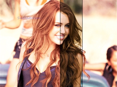
背景奥からフォト画像が、回転しながら迫る...縮小・拡大するスタイルのスライド..
私には美的センスが皆無なのでいい素材が用意できませんが、お楽しみをサイトで
発生させる効果を、得られるかはあなたの素材次第..
まずは、作動を確認してみてくださいね....


表示用HTML は、以下コピーして取り付けたいページに張り付け
次は、5つの画像コードを書き換え ..
注意事
貼り付けは以下のコード位置で、<li><を右移動しないでください..
左にスペース開けると...一つ飛ばされての表示となります。
<div id="bord">
<li><img src="<% pageDepth %>img/sr1.jpg"style="height:300px;width:300px;" alt="" /></li>
<li><img src="<% pageDepth %>img/sr2.jpg"style="height:300px;width:300px;" alt="" /></li>
<li><img src="<% pageDepth %>img/sr3.jpg"style="height:300px;width:300px;" alt="" /></li>
<li><img src="<% pageDepth %>img/sr4.jpg"style="height:300px;width:300px;" alt="" /></li>
<li><img src="<% pageDepth %>img/sr5.jpg"style="height:300px;width:300px;" alt="" /></li>
</div>
ここまで ..
CSSは以下、スタイルシートに張り付け...
トップPやカテゴリー、エントリーPでランダム作動させる際は、スタイルシートへ配置...
エントリーP..単体...個別ページでのみという場合は、スタイルの割り込み記載で
よろしいかと思います?
サイズ調整は、bordで行ってください..
改正...ボーダー枠右側の、下側と枠が表示されておりませんでしたが、原本HTMLの指定値
よりサイズを10pxワイド化することで対応済み...
/* 表示枠 bord */
#bord {
position:relative;
width:310px;height:310px;
background:#000;
overflow:hidden;
}
#bord ul {
list-style:none;
}
/* 表示写真の設定 */
#bord li img {
position:absolute;
top:0px;
left:0px;
border-top:5px solid #ddd;
border-left:5px solid #ddd;
border-right:5px solid #555;
border-bottom:5px solid #555;
opacity:0;
-webkit-transform-origin:50% 50%;
transform-origin:50% 50%;
}
/* 各スライドのanimation設定(4秒ずつずらしてplay)*/
#bord li:nth-child(1) img {
-webkit-animation:selfrot 20s ease 0s infinite;
animation:selfrot 20s ease 0s infinite;
}
#bord li:nth-child(2) img {
-webkit-animation:selfrot 20s ease 4s infinite;
animation:selfrot 20s ease 4s infinite;
}
#bord li:nth-child(3) img {
-webkit-animation:selfrot 20s ease 8s infinite;
animation:selfrot 20s ease 8s infinite;
}
#bord li:nth-child(4) img {
-webkit-animation:selfrot 20s ease 12s infinite;
animation:selfrot 20s ease 12s infinite;
}
#bord li:nth-child(5) img {
-webkit-animation:selfrot 20s ease 16s infinite;
animation:selfrot 20s ease 16s infinite;
}
@-webkit-keyframes selfrot {
0% {-webkit-transform:rotate(-180deg) scale(0,0);opacity:1;}
5% {-webkit-transform:rotate(0deg) scale(1,1);}
15% {-webkit-transform:rotate(0deg) scale(1,1);}
20% {-webkit-transform:rotate(180deg) scale(0,0);}
100%{-webkit-transform:rotate(180deg) scale(0,0);opacity:1;}
}
@keyframes selfrot {
0% {transform:rotate(-180deg) scale(0,0);opacity:1;}
5% {transform:rotate(0deg) scale(1,1);}
15% {transform:rotate(0deg) scale(1,1);}
20% {transform:rotate(180deg) scale(0,0);}
100%{transform:rotate(180deg) scale(0,0);opacity:1;}
}
ここまで~
作動はプレビューでご確認いただけます...
その他スタイルは、巻末の記事メニューを御覧ください...
スポンサーリンク
- 横ブラインド形状スライド効果
- シリウスに取り付け可能な横ブラインド形状のスライドショー効果を発生させる...ソース、CSSを追加しておりますので作動をご覧ください
- 速攻でデフォルトタイプスライド効果を発生させる
- シリウスに限らずですが、簡単に動くスライドをCSS形成ですぐに作ることができます....でも、名の通り基本みたいなデフォルト作動ですよ...