 サイトマップ
ワイドヘッダーでボディとスライドする指定方法及び伴うカスタマイズ (中段以降掲載)
サイトの幅(記事行の範囲、サイドメニューまで)は、シリウスのデフォルトサイズで
ヘッダーサイズだけをPC画面の横サイズいっぱいに表示するという
ブログなどではみられるボディとヘッダーを重なりスライドするスタイルへのカスタマイズ
サイトスのクロールに従いボディ(記事台紙の部分)が、ヘッダーを覆い隠すという
シリウスのHTML、スタイルシートでCSS追加、書き換え調整で実現できます
現時点、私がみたところ、ワールドプレス公式サイトの配布テンプレートで1つ
グーグルブロガーテンプレートで複数の同作動が確認できましたが、
ワールドプレスでほとんど見られないは意外でした
ウェブ上全般ではもっと使われているような気がします....
画像で参照、もしくは当サイトのスクロールで確認してください
ヘッダーは固定されておりますね
ボディを上に上昇するとヘッダー上にスライド、重なり隠してますね
ノンスクロール状態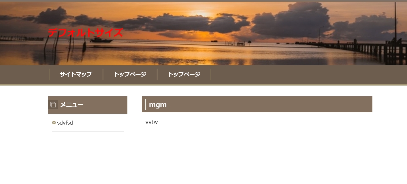
オンスクロール
トップのレイアウト順入れ替え
レイアウトの表示では、デフォルトではヘッダーがナビ下に位置されますが、
当サイトのCSS指定では画像例のようにサイトのトップに位置替えされます
HTML指定により、ナビを最上部に移動もできますが、ここで記載すると
コンテンツが重複してしまうので求める方は、以下サイトで指定方法をご確認ください
ナビの位置を変更するHTML指定
ヘッダー画像について
今回の解説では、シリウス操作画面で導入するヘッダー画像を使用します
ワイドサイズで表示する場合、自動拡張はされないので原本サイズを
拡張してください..
寸足らずの場合は、スペースが空きますが、1800Px以上でならおさまるかと思います
お詫び
ヘッダーがレスポンシブ化しなったようですみません
追加記載してますのでご確認ください
ボディは拡張されるが、サイト幅はデフォルトのままの意味
今回のボディとヘッダーのスライド効果を見ると、ボディ全域が上に移動します
しかし、デフォルトのサイト幅はそのままに抑えられておりますね
これは、記事の背景のみをフルオートで自動拡張
しかし、サイト幅は、記事やサイドメニューがおさまる枠コード、
layoutboxでデフォルトそのままに位置に置かれるよう指定しているからです
追記 スマホの表示でヘッダー縦幅が半分しか表示されない?
ヘッダーの画像の縦幅なのですが、枠にちょうど収まるサイズですとスマートフォン表示の場合、
50%の表面積に縮小してしまう..縦半分が小さくなり..背景が表れるのです
下の見えない箇所も倍の比率で入れときましょう
それでもPC画面では数値指定してますので表示されるのは上のサイズ分だけです
改行に進みます
スタイルシートを開いてください
ステップ1
contentsの幅を書き換え
記事台紙 ボディをフルオートで自動拡張
/* レイアウト
==================================================
*/
#wrapper {
overflow: hidden;
text-align: center;
}
#contents {
margin: 0 auto;
padding: 30px 0 50px;
position: relative;
text-align: center;
width: 900px; /* ここを auto にする */
background-color: #FFF;
}
ステップ2
ヘッダー画像のワイド指定とレスポンシブ化指定
ヘッダー画像をPC画面サイズいっぱいに拡張するは、
/* ここからの記載を追加する */を確認
/* ヘッダー
==================================================
*/
#headerbox .inner {
text-align: center;
}
#header {
height: auto;
margin: 0 auto;
position: relative;
text-align: left;
width: 900px;
/* ここからの記載を追加する */
position: fixed !important;
position: absolute;
top: 0px;
left: 0;
width: 100%;
z-index: -10;
}
ここまでを追加です
レスポンシブ化を指定する
上記項目のすぐ直下にある header imgをメディアコードで囲む作業へ進みます
現本を確認
#header img {
left: 0;
position: absolute;
top: 0;
}
以下に書き換えてください(コード追加です)
@media screen and (max-width: 640px) {
#header img {
left: 0;
position: absolute;
top: 0;
width: 100%;
height: 200px;
}
}
説明をお読みください
ノンカスタイズのレスポンシブCSSでしたらこのままでも自動縮小するのですが
今回の変更を加えると不作動となってしまうため media コードで囲みました
height: 200px;は、なぜ追加したか?ですが、デフォルトTP同様自動縮小に従い縦幅も
狭りますね...その回避措置
それはそれでよいというなら、はずしてください
ただし、横画像だけせばまるが、縦幅はそののまま...変化を確認しご判断ください
ここで、申し訳ございません...シリウスバージョン1.5以降...次の項目も、header以下に
追加しないと正常化しなくなりました?
#layoutbox{
margin: 0 auto;
padding: 0px 0 5px;
position: relative;
background-color: #FBF8FB;
width: 1250px;
}
@media screen and (max-width: 1000px) {
#layoutbox{
margin: 0 auto;
padding: 0px 0 50px;
position: relative;
background-color: #FFF;
width: 100%;
}
}
ステップ3
ここも、layoutboxですが、ここはここで必要です..
記事内幅を指定する
#contentsでは、記事台紙をフルオートにしましたが、
記事行 サイト幅はlayoutbox内に収めるための
指定です
この行を、組み込まない場合は、記事行、サイドメニューがPC画面いっぱいに
表示されます
この記述は、改行ではありません
新たな追加行ですので
layoutboxの下においてください
#layoutbox{
margin: 0 auto;
padding: 0px 0 50px;
position: relative;
background-color: #FFF;
width: 900px;
}
上は、PC用です
アイフォン スマートフォンで記事行が折り返えされる作用を指示するため
以下行も追加してください
@media screen and (max-width: 900px) {
#layoutbox{
margin: 0 auto;
padding: 0px 0 50px;
position: relative;
background-color: #FFF;
width: 100%;
}
}
ここまででスライド化は作動しますが、ワイドヘッダーの際...
もしくは、うまく反映しない場合、以下logo項目を張り替えてみてください..
/* トップ
==================================================
*/
#top {
margin: 0 auto;
text-align: left;
width: 900px;
}
#top #logo, #top h1 {
padding: 28px 0;
width: 600px;
}
#top #logo a, #top h1 a {
color: #4e7ba0;
text-shadow: 0 0 1px rgba(78,123,160,.3);
font-size: 26px;
font-weight: 600;
text-decoration: none;
}
#top #logo a img, #top h1 a img {
vertical-align: middle;
}
@media screen and (max-width: 899px) {
#top {
width: auto;
}
#top #logo, #top h1 {
-webkit-box-sizing: border-box;
-moz-box-sizing: border-box;
box-sizing: border-box;
padding: 28px 0 28px 10px;
width: 66.6666666667%;
}
}
@media screen and (max-width: 640px) {
#top #logo, #top h1 {
padding: 18px 60px 18px 10px;
width: auto;
}
#top #logo a, #top h1 a {
font-size: 18px;
}
}
ここまで...
/* ヘッダー
記事を追加します..面倒回避で行けます..
オールCSS改変済みコード コピペで完了
シリウスBJ1.5以降...過去カスタマイズテンプレートの不作動箇所が、まれに
見られていますので、以下にノーマル2カラムCSSソースから上例のカスタムを
入れ込み正常作動確認済みのソースをすべて貼り付けておきますので
コピペで張替え...即時完了します..
2018 1213確認
サイトカラーだけは、カラーコードで変更ください..
HTMLはいじらずとも作用します...
==================================================
スタイルの初期化
==================================================
*/
*{
margin: 0;
padding: 0;
}
html, body, div, span, applet, object, iframe, h1, h2, h3, h4, h5, h6, p, blockquote, pre, a, abbr, acronym, address, big, cite, code, del, dfn, em, font, img, ins, kbd, q, s, samp, small, strike, strong, sub, sup, tt, var, b, u, i, center, dl, dt, dd, ol, ul, li, fieldset, form, label, legend, table, caption {
background: transparent;
border: 0;
font-size: 100%;
outline: 0;
vertical-align: baseline;
}
blockquote:before, blockquote:after, q:before, q:after {
content: '';
content: none;
}
body { line-height: 1; }
ol, ul { list-style: none; }
blockquote, q { quotes: none; }
div, p, h1, h2, h3, h4, h5, h6 {
_zoom: 1;
display: block;
text-align: left;
}
img {
border: 0;
}
@media screen and (max-width: 899px) {
img {
font-size: 0;
height: auto;
line-height: 0;
max-width: 100%;
vertical-align: top;
}
}
@media screen and (max-width: 640px) {
img {
float: none !important;
}
}
:focus { outline: 0; }
ins { text-decoration: none; }
del { text-decoration: line-through; }
table {
border-collapse: collapse;
border-spacing: 0;
}
input, select {
vertical-align: middle;
}
/*
==================================================
基本スタイル
==================================================
*/
body {
background-color: #fcfbf4;
border-top: 4px solid #83705e;
color: #333333;
font-family: 'メイリオ', Helvetica, 'Hiragino Kaku Gothic Pro', sans-serif;
font-size: 15px;
line-height: 180%;
text-align: center;
letter-spacing: -0.001em;/* iOS4でのテキストの隙間への対応 */
-webkit-text-size-adjust: 100%;/* 文字サイズの自動調整機能のキャンセル */
background-attachment:fixed;
}
h1, h2, h3, h4, h5, h6, .title, dt {
font-family: 'ヒラギノ角ゴ Pro W3','Hiragino Kaku Gothic Pro','メイリオ',Meiryo,Verdana,'MS Pゴシック',sans-serif;
font-weight: 700;
}
.clear {
clear: both;
font-size: 1px;
line-height: 0;
}
/* リスト
==================================================
*/
ul {
margin: 0 10px;
padding: 10px 0;
}
ul li {
background-image: url(img/li.png);
background-position: 5px 8px;
background-repeat: no-repeat;
padding: 0 0 0 16px;
}
ol {
list-style-type: decimal;
margin: 0 10px;
padding: 10px 0 10px 25px;
}
/* リンク
==================================================
*/
a { color: #0066cc; }
a:hover {
color: #0066cc;
text-decoration: none;
}
a:hover img {
background: none !important;
}
a img { background: none !important; }
#main a:hover, #menu a:hover, #rmenu a:hover, #pagetop a:hover {
left: 1px;
position: relative;
top: 1px;
}
@media screen and (max-width: 640px) {
#main a:hover, #menu a:hover, #rmenu a:hover, #pagetop a:hover {
left: 0;
position: static;
top: 0;
}
}
/*
==================================================
全体
==================================================
*/
/* レイアウト
==================================================
*/
#wrapper {
overflow: hidden;
text-align: center;
}
#contents {
margin: 0 auto;
padding: 30px 0 50px;
position: relative;
text-align: center;
width: auto;
background-color: #FFF;
}
#layoutbox{
margin: 0 auto;
padding: 0px 0 50px;
position: relative;
background-color: #FFF;
width: 900px;
}
@media screen and (max-width: 900px) {
#layoutbox{
margin: 0 auto;
padding: 0px 0 50px;
position: relative;
background-color: #FFF;
width: 100%;
}
}
#siteNavi {
font-size: 15px;
margin-bottom: 10px;
}
@media screen and (max-width: 899px) {
#contents {
padding: 30px 10px 50px;
width: auto;
}
#layoutbox{
padding: 5px;
}
}
@media screen and (max-width: 640px) {
#contents {
padding: 15px 0 50px;
}
#layoutbox{
padding: 5px 0;
}
#siteNavi {
font-size: 13px;
margin-bottom: 5px;
padding: 0 10px;
}
}
/* ページ上部へ戻る
==================================================
*/
#pagetop {
bottom: -3px;
clear: both;
position: absolute;
right: 10px;
z-index: 5;
}
#pagetop a {
background-image: url(img/pagetop_button.png);
background-position: left top;
background-repeat: no-repeat;
display: block;
height: 28px;
overflow: hidden;
text-indent: -9999px;
width: 100px;
}
@media screen and (max-width: 899px) {
#pagetop {
right: 10px;
}
#pagetop a {
background-image: url(img/pagetop_button2@.png);
background-position: right top;
padding-right: 50px;
}
}
@media screen and (max-width: 640px) {
#pagetop {
bottom: 0;
overflow: hidden;
right: 0;
width: 100%;
border-top: 3px solid #e5e3da;
}
#pagetop a {
background-image: url(img/pagetop_button_smp.png);
background-position: center center;
background-repeat: no-repeat;
background-color: #83705e;
border: none;
font-size: 13px;
height: 40px;
line-height: 40px;
padding: 0;
position: relative;
text-align: center;
width: 100%;
}
}
/* 検索ボックス
==================================================
*/
#searchbox {
background-image: url(img/search_input.png);
background-position: right top;
background-repeat: no-repeat;
font-size: 12px;
left: auto;
height: 28px;
margin-left: 0;
position: absolute;
top: 2px;
width: 100%;
max-width: 900px;
}
#searchbox input {
background-color: transparent;
border: none;
cursor: pointer;
height: 24px;
overflow: hidden;
position: absolute;
right: 170px;
text-indent: -9999px;
top: 2px;
vertical-align: middle;
width: 28px;
}
#searchbox form {
margin: 0;
padding: 0;
position: relative;
}
#searchbox .skwd {
background-image: none;
border: 0 none;
cursor: auto;
font-size: 12px;
right: 6px;
line-height: 18px;
text-indent: 0;
width: 160px;
}
@media screen and (max-width: 640px) {
#searchbox {
background-color: #83705e;
background-image: url(img/searchbutton.png);
background-position: 15px 5px;
background-repeat: no-repeat;
margin: 10px auto 5px;
padding: 0 15px;
height: 40px;
top: auto;
right: auto;
position: relative;
width: 100%;
color: #333;
}
#searchbox input {
width: 30px;
height: 26px;
padding: 0;
color: #333;
left: 0px;
-webkit-appearance: none;
}
#searchbox input.skwd {
font-size: 14px;
margin: 0 0 0 30px;
padding: 0px 5px 0 5px;
background-color: #fff;
overflow: hidden;
max-width: 100%;
width: 82%;
}
}
/* 回り込み・回り込み解除
==================================================
*/
.txt-img {
}
.txt-img img{
margin: 0 8px 8px 8px;
}
.center {
margin-bottom: 5px;
margin-top: 5px;
text-align: center;
}
.float-l { float: left;}
.float-r { float: right;}
.float-l img,
.float-r img {
margin-bottom: 20px;
}
.float-l img {
margin-right: 20px;
}
.float-r img {
margin-left: 20px;
}
.clear, .FloatEnd {
clear: both;
font-size: 1px;
height: 0;
line-height: 0;
}
/* (スマホ用)画像の中央揃え処理 */
@media screen and (max-width: 640px) {
.txt-img{
padding: 0 10px;
text-align: center !important;
}
.txt-img,.txt-img img{
float:none !important;
}
.float-l p,.float-l{
text-align:center;
float:none;
}
}
/*
==================================================
トップ部分
==================================================
*/
/* トップ
==================================================
*/
#top {
margin: 0 auto;
text-align: left;
width: 1000px;
}
#top #logo, #top h1 {
padding: 100px; 0;
width: 900px;
}
#top #logo a, #top h1 a {
color: #FFf;
text-shadow: 0 0 1px rgba(153,153,153,.3);
font-size: 30px;
font-weight: 900;
text-decoration: none;
line-height: 150%;
}
#top #logo a img, #top h1 a img {
vertical-align: middle;
}
@media screen and (max-width: 899px) {
#top {
width: auto;
}
#top #logo, #top h1 {
-webkit-box-sizing: border-box;
-moz-box-sizing: border-box;
box-sizing: border-box;
padding: 28px 0 28px 10px;
width: 66.6666666667%;
}
}
@media screen and (max-width: 640px) {
#top #logo, #top h1 {
padding: 18px 60px 18px 10px;
width: auto;
}
#top #logo a, #top h1 a {
font-size: 18px;
}
}
/* ヘッダー
==================================================
*/
#headerbox .inner {
text-align: center;
}
#header {
height: 350px;
margin: 0 auto;
position: relative;
text-align: left;
position: fixed !important;
position: absolute;
top: 0px;
left: 0;
width: auto;
z-index: -10;
}
#layoutbox{
margin: 0 auto;
padding: 0px 0 5px;
position: relative;
background-color: #FFFFF;
width: 1000px;
}
@media screen and (max-width: 1000px) {
#layoutbox{
margin: 0 auto;
padding: 0px 0 50px;
position: relative;
background-color: #FFF;
width: 100%;
}
}
#header img {
left: 0;
position: absolute;
top: 0;
}
#header #headertxt {
left: 50%;
position: absolute;
top: 80px;
width: 45%;
<% pageTitlePlace %>
<% pageDescPlace %>
}
#header .title, #header .desc{
padding-left: 5px;
padding-right: 5px;
}
#header .title a {
color:#83705e;
text-shadow: 0 0 1px rgba(131,112,94,.3);
font-size: 28px;
font-weight: 700;
line-height: 120%;
text-decoration: none;
word-wrap: break-word;
}
#header .desc {
color:#333;
font-size: 15px;
line-height: 160%;
padding-top: 15px;
word-wrap: break-word;
}
#header .desc span {
color:#333;
font-size: 15px;
padding-top: 15px;
}
@media screen and (max-width: 899px) {
#headerbox {
position: relative;
}
#header {
height: auto !important;
width: auto;
}
#header img {
position: static;
}
}
@media screen and (max-width: 640px) {
#header #headertxt {
padding: 15px 15px 5px;
position: static;
width: auto;
}
#header .title {
text-align: center;
text-shadow: 1px 1px 1px rgb(204, 204, 204);
}
#header .title a {
color:#83705e;
font-size: 20px;
}
#header .desc {
color:#343434;
font-size: 12px;
}
}
/* トップメニュー
==================================================
*/
*:first-child+html body {
padding-left: 1px;
}
#nav {
border-bottom: 4px solid #a19572;
background-color: #6d5d4e;
}
#topmenubox {
margin: 0 auto;
text-align: center;
width: 916px;
}
#topmenubox #topmenubtn {
display: none;
}
#topmenu ul,#topmenu li{
list-style-image: none;
list-style-type: none;
background-image: none;
}
#topmenu ul {
font-family: 'ヒラギノ角ゴ Pro W3','Hiragino Kaku Gothic Pro','メイリオ',Meiryo,Verdana,'MS Pゴシック',sans-serif;
font-weight: 700;
overflow: hidden;
width: 900px;
padding: 10px 0;
}
#topmenu li {
border-left: 1px solid #a19572;
border-right: 1px solid #83705e;
padding: 0;
float: left;
width: 148px;
}
#topmenu li:last-child{
border-right: 1px solid #a19572;
}
#topmenu li a {
list-style-image: none;
color: #fff;
display: block;
font-size: 1em;
text-shadow: 0 0 1px rgba(255,255,255,.3);
overflow: hidden;
padding: 3px;
text-align: center;
text-decoration: none;
}
#topmenu li a:hover {
text-decoration: underline;
}
@media screen and (max-width: 899px) {
#topmenubox {
padding: 0;
width: auto;
}
#topmenu ul {
background: none repeat scroll 0 0 transparent;
display: table;
width: 100%;
clear: both;
margin: 0;
}
#topmenu li {
background: none repeat scroll 0 0 transparent;
display: table-cell;
float: none;
margin: 0;
padding: 0;
width: auto;
}
#topmenu li:before {
clear: both;
background-color: transparent;
content: "";
height: auto;
left: auto;
position: static;
top: auto;
width: auto;
}
#topmenu li a {
position: relative;
}
}
@media screen and (max-width: 640px) {
#nav {
border-bottom: none;
background-color: none;
}
#topmenubox {
padding: 0;
position: relative;
margin: 0;
}
#topmenubox #topmenubtn {
color: #83705e;
cursor: pointer;
display: block;
font-size: 10px;
height: 20px;
padding-top: 15px;
position: absolute;
right: 10px;
text-align: center;
top: -45px;
width: 40px;
}
#topmenubox #topmenubtn:before {
border-bottom: 3px solid #83705e;
border-top: 3px solid #83705e;
content: "";
height: 3px;
left: 7px;
position: absolute;
top: 0;
width: 26px;
}
#topmenubox #topmenubtn:after {
border-top: 3px solid #83705e;
content: "";
height: 0;
left: 7px;
position: absolute;
top: 12px;
width: 26px;
}
#topmenu ul {
display: none;
table-layout: auto;
margin: 0;
padding: 0;
}
#topmenu ul.menuon {
display: block;
}
#topmenu li {
border-bottom: 1px solid #a19572;
display: block;
text-align: left;
}
#topmenu li:last-child {
border-bottom: none;
}
#topmenu li a {
color: #fff;
padding: 8px 45px 8px 20px;
position: relative;
text-align: left;
}
#topmenu li a:before {
border-bottom: none;
border-left: none;
border-right: 2px solid #ffffff;
border-top: 2px solid #ffffff;
background-color: transparent;
height: 5px;
margin-top: -4px;
right: 20px;
top: 50%;
-webkit-transform: rotate(45deg);
transform: rotate(45deg);
width: 5px;
}
#topmenu li:first-child a:after {
background-color: transparent;
left: 0;
width: 0;
}
#topmenu li:last-child{
border-right: none;
}
}
/*
==================================================
メインコンテンツ
==================================================
*/
/* 記事領域
==================================================
*/
#main {
float: right;
overflow: hidden;
word-wrap: break-word;
width: 680px;
}
@media screen and (max-width: 899px) {
#main {
width: 72.2222222222%;
}
}
@media screen and (max-width: 640px) {
#main {
float: none;
width: 100%;
}
}
#main .text, #text1, #text2, #text3, #text4, #text5, #text6, #text7, #text8, #text9, #text10, #space1, #space2 {
margin-bottom: 20px;
overflow: hidden;
padding: 10px;
}
/* 見出し
==================================================
*/
#main h2, #main h3 {
background-color: #83705e;
margin-bottom: 5px;
padding: 5px 0;
}
#main h2 span, #main h3 span {
display: block;
border-left: 4px solid #f1efe5;
color: #FFF;
font-size: 18px;
text-shadow: 0 0 1px rgba(255,255,255,.3);
margin: 2px 8px;
padding: 4px 0 0 8px;
}
#main .text h3, #text1 h3, #text2 h3, #text3 h3, #text4 h3, #text5 h3, #text6 h3, #text7 h3, #text8 h3, #text9 h3, #text10 h3, #space1 h3, #space2 h3 {
margin: 0 0 5px -10px;
}
#main h4 {
background-image: url(img/h4-border-Bottom.gif);
background-position: left bottom;
background-repeat: repeat-x;
margin: 5px auto;
position: relative;
}
#main h4 span {
background-image: url(img/h4.png);
background-position: left 10px;
background-repeat: no-repeat;
color: #83705e;
text-shadow: 0 0 1px rgba(131,112,94,.3);
display: block;
font-size: 17px;
padding: 3px 0 3px 12px;
position: relative;
}
#main h5 {
background-image: url(img/h5.png);
background-position: left top;
background-repeat: no-repeat;
color: #333333;
text-shadow: 0 0 1px rgba(51,51,51,.1);
font-size: 16px;
line-height: 150%;
margin: 3px auto;
padding-left: 28px;
}
#main h6 {
background-image: url(img/h6.png);
background-position: left 1px;
background-repeat: no-repeat;
color: #333333;
text-shadow: 0 0 1px rgba(51,51,51,.1);
font-size: 16px;
margin: 3px auto;
padding-left: 22px;
line-height: 140%;
}
#main .atn02 {
background-color: #f2f2f2;
background-image: url(img/atn_02.gif);
background-position: 14px 14px;
background-repeat: no-repeat;
margin: 20px 0 10px;
overflow: hidden;
padding: 20px 20px 20px 50px;
}
@media all and (-webkit-min-device-pixel-ratio: 1.5) {
#main .atn02 {
background-image: url(img/atn_02@2x.gif);
-webkit-background-size: 22px 32px;
background-size: 22px 32px;
}
}
#main .atn02 span {
border-bottom: 1px dashed #c2c2c2;
color: #4d4d4d;
font-weight: bold;
padding-bottom: 3px;
}
@media screen and (max-width: 640px) {
#main h2, #main h3 {
margin: 0;
}
#main .text h3, #text1 h3, #text2 h3, #text3 h3, #text4 h3, #text5 h3, #text6 h3, #text7 h3, #text8 h3, #text9 h3, #text10 h3, #space1 h3, #space2 h3 {
margin: 20px -10px 10px;
}
}
/*
==================================================
サイドメニュー
==================================================
*/
/* メニュー
==================================================
*/
#menu img{
max-width:100%;
height:auto;
}
#menu {
float: left;
overflow: hidden;
width: 305px;
}
#menu ul#newEntry, #menu ul#entryarchive, #rmenu ul#newEntry, #rmenu ul#entryarchive {
background-image: url(img/menubox_bg.gif);
background-position: center bottom;
background-repeat: repeat-x;
padding: 0 0 5px 0;
}
#menu .rankbox {
border-bottom: 1px solid #E6E6E6;
font-size: 12px;
margin-bottom: 10px;
padding-bottom: 10px;
}
#menu .rankbox img {
width: 185px;
}
.menubox {
margin-bottom: 25px;
}
.menulist {
margin-bottom: 0 !important;
overflow: hidden;
}
.menulist ul {
margin-bottom: 25px;
padding: 0 0 5px 0;
}
.menulist li {
background: none repeat scroll 0 0 transparent;
border-bottom: 1px solid #e6e6e6;
line-height: 150%;
padding: 0;
position: relative;
}
.menulist li a {
background-image: url(img/menu_bg.png);
background-position: 1px 17px;
background-repeat: no-repeat;
color: #333333;
display: block;
font-size: 14px;
padding: 12px 10px 12px 15px;
text-decoration: none;
}
.menulist li a:hover {
color: #998b84;
text-decoration: underline;
}
.menulist .l2 a {
background-image: url(img/menu_bg2.png);
background-position: 15px 18px;
font-weight: normal;
padding-left: 26px;
}
.menulist .l3 a {
background-image: url(img/menu_bg2.png);
background-position: 30px 18px;
font-weight: normal;
padding-left: 41px;
}
#menu .title, #rmenu .title, #menu h4, #rmenu h4 {
background-color: #83705e;
border-bottom: 2px solid #fafafa;
overflow: hidden;
position: relative;
text-shadow: none;
margin: 0;
}
#menu .title span, #rmenu .title span, #menu h4 span, #rmenu h4 span {
background-image: url(img/menu-h4.png);
background-position: left 11px;
background-repeat: no-repeat;
color: #fff;text-shadow: 0 0 1px rgba(255,255,255,.3);
display: block;
font-size: 16px;
padding: 14px 8px 14px 34px;
line-height: 130%;
}
@media screen and (max-width: 899px) {
#menu {
width: 24.4444444444%;
}
#column2 .menulist li a , .menulist .l2 a , .menulist .l3 a {
position: relative;
}
}
@media screen and (max-width: 640px) {
#menu {
float: none;
width: 100%;
}
#menu .title, #rmenu .title, #menu h4, #rmenu h4 {
margin-left: 0;
}
#menu .title span, #rmenu .title span, #menu h4 span, #rmenu h4 span {
font-size: 18px;
}
.menulist ul {
margin-bottom: 5px;
}
.menulist .l2,
.menulist .l3 {
display: none;
}
.menubox {
margin-bottom: 0;
}
#menu .title span, #rmenu .title span, #menu h4 span, #rmenu h4 span {
border-bottom: 1px solid #e6e6e6;
border-left: none;
border-right: none;
border-top: 1px solid #e6e6e6;
}
}
/* バナー領域
==================================================
*/
.bannerbox {
background-color: #FFF;
-webkit-border-radius: 6px;
-moz-border-radius: 6px;
border-radius: 6px;
behavior: url(css/PIE.htc);
margin-bottom: 10px;
position: relative;
}
.bannerbox ul {
padding: 5px;
}
.bannerbox li {
background: none repeat scroll 0 0 transparent;
margin-bottom: 5px;
padding: 0;
}
.bannerbox li a {
font-size: 15px;
}
.bannerbox li a img {
vertical-align: bottom;
}
@media screen and (max-width: 899px) {
.bannerbox li:before {
background-color: transparent;
content: "";
height: auto;
left: auto;
position: static;
top: auto;
width: auto;
}
.menulist li:before {
background-color: transparent;
}
}
@media screen and (max-width: 640px) {
.bannerbox li {
margin-bottom: 10px;
text-align: center;
}
}
/* 最新記事・アーカイブ
==================================================
*/
ul#newEntry li, ul#entryarchive li {
background: none repeat scroll 0 0 transparent;
border-bottom: 1px solid #E6E6E6;
font-size: 12px;
line-height: 140%;
padding: 15px 10px;
}
@media screen and (max-width: 899px) {
ul#newEntry li:before, ul#entryarchive li:before {
background-color: transparent;
content: "";
height: auto;
left: auto;
position: static;
top: auto;
width: auto;
}
}
/*
==================================================
フッター
==================================================
*/
#footer {
border-top: 3px solid #e5e3da;
background-color: #83705e;
color: #FFF;
font-size: 12px;
margin: 0 auto;
text-align: center;
}
#footer .inner {
margin: 0 auto;
overflow: hidden;
padding: 2px 0 2px;
width: 900px;
text-align: center;
font-size: 13px;
}
#footer a {
color: #FFF;
}
#footer p {
float: right;
overflow: hidden;
position: relative;
word-wrap: break-word;
}
#footlinkbox {
background-color: #83705e;
padding: 10px 10px 5px;
text-align: center;
}
#footermenu {
ont-size: 0;
letter-spacing: -.40em;
line-height: 26px;
margin: 0 auto;
text-align: left;
max-width: 900px;
}
#footermenu span {
display: inline-block;
margin: 0 25px 5px 0;
*display: inline;
*zoom: 1;
}
#footermenu a {
border-right: 1px solid #a19572;
color: #fff;
letter-spacing: normal;
line-height: 140%;
font-size: 12px;
padding-right: 25px;
text-decoration: none;
}
#footermenu a:hover {
text-decoration: underline;
}
#footer #footsub {
text-align: center;
max-width: 900px;
height: auto;
margin: 10px auto 0;
}
#footer .copyright {
display: block;
background-color: #6d5d4e;
line-height: 28px;
text-align: center;
font-size: 14px;
}
@media screen and (max-width: 899px) {
#footer .inner {
text-align: center;
max-width: 100%;
}
#footlinkbox {
padding: 15px 0 5px 10px;
}
#footermenu {
max-width: 100%;
}
}
@media screen and (max-width: 640px) {
#footer {
background-image: none;
border-top: none;
}
#footlinkbox {
margin-bottom: 0;
padding: 0;
}
#footermenu span {
border-bottom: 1px solid #a19572;
display: block;
margin: 0;
}
#footermenu a {
border-right: none;
display: block;
font-size: 13px;
padding: 12px 24px 12px 10px;
position: relative;
text-decoration: none;
}
#footermenu {
position: static;
width: auto;
margin: 0;
padding: 0;
}
#footer .inner {
background-color: #83705e;
padding: 0px 10px 10px 0;
line-height: 130%;
}
#footer #footsub {
text-align: center;
}
#footer #footsub a {
text-decoration: none;
}
#footer #footsub a:first-child {
border-left: none;
}
}
/*
==================================================
トップページ
==================================================
*/
#whatsnew {
margin-bottom: 20px;
position: relative;
}
#whatsnew .title {
background-color: #83705e;
margin-bottom: 5px;
padding: 5px 0;
}
#whatsnew .title span {
background-image: url(img/whatsnew_title.png);
background-position: left top;
background-repeat: no-repeat;
display: block;
color: #FFF;text-shadow: 0 0 1px rgba(255,255,255,.3);
font-size: 18px;
font-weight: 600;
margin: 2px 0px;
padding: 4px 38px;
}
#whatsnew ul {
padding: 0;
}
#whatsnew ul li {
background: none repeat scroll 0 0 transparent;
border-bottom: 1px dotted #ccc;
font-size: 15px;
padding: 10px 15px;
position: relative;
}
#whatsnew ul li span {
padding-right: 10px;
}
@media screen and (max-width: 899px) {
#whatsnew .title {
position: relative;
}
#whatsnew ul li:before {
background-color: transparent;
}
}
@media screen and (max-width: 640px) {
#whatsnew {
background-color: #fbfbfb;
margin-bottom: 0;
padding: 10px 0 0;
}
#whatsnew .title {
margin-right: 0;
border-bottom: none;
}
#whatsnew ul {
background-color: #ffffff;
border-bottom: 1px solid #e6e6e6;
}
#whatsnew ul:last-child {
border-bottom: none;
}
#whatsnew ul li:last-child {
border-bottom: none;
}
#whatsnew ul li span {
color: #666666;
display: block;
padding-right: 0;
}
}
/*
==================================================
カテゴリーページ
==================================================
*/
#categorylist {
padding: 10px;
}
#categorylist .catbox {
background-color: #fcfbf4;
margin-right: 10px;
margin-bottom: 30px;
overflow: hidden;
position: relative;
font-size: 15px;
_height: 1%;
}
#categorylist .thumb {
float: left;
padding: 0 20px 0 0;
}
#categorylist .thumb img {
vertical-align: bottom;
}
#categorylist .body {
overflow: hidden;
}
#categorylist .title {
background-image: url(img/h4-border-Bottom.gif);
background-position: left bottom;
background-repeat: repeat-x;
font-weight: 700;
margin-bottom: 10px;
overflow: hidden;
padding: 10px 15px 8px 15px;
}
#categorylist .title a {
background-image: url(img/category_title.png);
background-position: left 9px;
background-repeat: no-repeat;
color: #83705e;
font-size: 18px;
line-height: 1.6;
text-decoration: none;
padding: 6px 22px 13px;
}
#categorylist p {
font-size: 15px;
line-height: 170%;
padding: 0 15px;
}
#categorylist .more {
float: right;
height: 30px;
margin: 10px 1px 1px 0;
padding: 0 15px 15px 0;
_height: 1%;
}
#categorylist .more a {
background-image: url(img/button_more2.png);
background-position: right 6px;
background-repeat: no-repeat;
display: block;
padding-right: 19px;
color: #83705e;
}
#pagelist {
margin-bottom: 10px;
margin-top: 10px;
padding: 10px;
text-align: center;
}
#pagelist ul {
letter-spacing: -0.4em;
padding: 0;
}
#pagelist li {
background: none repeat scroll 0 0 transparent;
display: inline-block;
letter-spacing: normal;
list-style-type: none;
margin: 0 5px 10px;
padding: 0;
*display: inline;
*zoom: 1;
}
#pagelist a {
background-color: #fbfbfb;
border: 1px solid #e6e6e6;
color: #333333;
display: inline-block;
padding: 6px 15px;
text-align: center;
text-decoration: none;
*display: inline;
*zoom: 1;
}
#pagelist a:hover {
background-color: #333333;
color: #FFF;
}
@media screen and (max-width: 899px) {
#categorylist .more a {
background-position: right 4px;
display: block;
font-size: 15px;
height: 26px;
line-height: 24px;
overflow: hidden;
position: relative;
text-align: center;
text-indent: inherit;
}
#categorylist .more a:before {
border-bottom: none;
border-left: none;
border-right: 1px solid #ffffff;
border-top: 1px solid #ffffff;
content: "";
height: 4px;
margin-top: -2px;
position: absolute;
right: 16px;
top: 50%;
-webkit-transform: rotate(45deg);
transform: rotate(45deg);
width: 4px;
}
#pagelist li:before {
background-color: transparent;
content: "";
height: auto;
left: auto;
position: static;
top: auto;
width: auto;
}
}
@media screen and (max-width: 640px) {
#categorylist .catbox {
padding: 15px;
}
#categorylist .thumb {
float: left;
padding: 0 15px 0 0;
}
#categorylist .thumb img {
max-width: 100px;
}
#categorylist .title {
padding: 5px 0;
}
#categorylist .title a {
font-size: 16px;
background-position: left 5px;
line-height: 1.6;
padding: 4px 22px 15px;
}
#categorylist p {
font-size: 14px;
line-height: 150%;
}
}
/*
==================================================
エントリーページ
==================================================
*/
#entrylist {
margin-right: 10px;
margin-bottom: 20px;
background-color: #fcfbf4;
}
#entrylist .inner {
overflow: hidden;
text-align: left;
}
#entrylist h4 {
background-image: none;
background-color: #83705e;
margin-bottom: 5px;
padding: 5px 0;
}
#entrylist h4 span {
background-image: url(img/entrylist-h4.png);
background-position: left 2px;
background-repeat: no-repeat;
display: block;
color: #FFF;text-shadow: 0 0 1px rgba(255,255,255,.3);
line-height: 32px;
font-size: 18px;
margin: 2px 8px 2px 0;
padding: 4px 8px 2px 38px;
}
#entrylist dl {
overflow: hidden;
position: relative;
top: -1px;
*height: 1%;
}
#entrylist dt {
border-top: 1px dotted #ccc;
margin: 0 10px;
padding: 15px 5px;
position: relative;
*height: 1%;
}
#entrylist dt:first-child {
border-top: none;
}
#entrylist dt a {
background-image: url(img/entry_title.png);
background-position: left 4px;
background-repeat: no-repeat;
display: inline-block;
font-size: 15px;
font-weight: 500;
line-height: 150%;
padding: 1px 0 1px 19px;
*display: inline;
*zoom: 1;
}
#entrylist dd {
font-size: 15px;
line-height: 150%;
margin-top: -10px;
padding: 0 10px 15px 25px;
}
#searchresult {
margin-bottom: 20px;
overflow: hidden;
padding: 10px;
}
#relNavigate {
margin-bottom: 15px;
padding-bottom: 10px;
padding-top: 10px;
text-align: center;
}
#relNavigate a {
font-size: 14px;
font-weight: 700;
margin-left: 10px;
margin-right: 10px;
}
@media screen and (max-width: 640px) {
#entrylist {
margin: 0;
padding: 0;
}
#entrylist h4 {
margin-left: -10px;
padding: 8px;
}
#entrylist h4 span {
font-size: 18px;
}
#entrylist dl {
border-bottom: none;
padding: 0 5px;
top: 0;
}
#entrylist dt {
padding: 15px 5px;
}
#entrylist dt:first-child {
border-top: none;
}
#entrylist dt a {
font-size: 15px;
}
#entrylist dt a:hover {
position: relative;
}
#entrylist dd {
font-size: 14px;
line-height: 140%;
padding: 0 5px 15px 20px;
}
#relNavigate a {
background-color: #FBFBFB;
color: #333333;
display: inline-block;
height: 40px;
line-height: 40px;
position: relative;
text-decoration: none;
width: 35%;
z-index: 0;
}
#relNavigate a:hover {
position: relative;
}
#relNavigate a:first-child {
border-bottom: 1px solid #E6E6E6;
border-right: 1px solid #E6E6E6;
border-top: 1px solid #E6E6E6;
}
#relNavigate a:last-child {
border-bottom: 1px solid #E6E6E6;
border-left: 1px solid #E6E6E6;
border-top: 1px solid #E6E6E6;
}
#relNavigate a:before {
background-color: #FBFBFB;
content: "";
height: 29px;
position: absolute;
top: 5px;
-webkit-transform: rotate(45deg);
transform: rotate(45deg);
width: 29px;
z-index: -1;
}
#relNavigate a:first-child:before {
border-bottom: 1px solid #E6E6E6;
border-left: 1px solid #E6E6E6;
left: -15px;
}
#relNavigate a:last-child:before {
border-right: 1px solid #E6E6E6;
border-top: 1px solid #E6E6E6;
right: -15px;
}
}
/*
==================================================
サイトマップページ
==================================================
*/
#sitemaps ul {
margin: 0;
padding: 5px 10px;
}
#sitemaps li {
background-image: none;
line-height: 0;
padding: 0;
}
#sitemaps .l1 {
margin-top: 10px;
}
#sitemaps .l2 {
margin-top: 5px;
}
#sitemaps .l3 {
margin-top: 5px;
}
#sitemaps li a {
background-image: url(img/menu_bg.png);
background-position: left 8px;
background-repeat: no-repeat;
display: inline-block;
line-height: 180%;
list-style-image: none;
list-style-type: none;
padding-left: 12px;
*display: inline;
*zoom:1;
color: #333;
text-decoration: none;
}
#sitemaps .l1 a {
font-size: 16px;
font-weight: 700;
}
#sitemaps .l2 a {
background-image: url(img/menu_bg2.png);
font-size: 14px;
margin-left: 25px;
}
#sitemaps .l3 a {
background-image: url(img/menu_bg2.png);
background-position: left 6px;
font-size: 12px;
margin-left: 45px;
}
@media screen and (max-width: 640px) {
#sitemaps ul {
padding: 0 10px;
}
#sitemaps li {
border-bottom: 1px solid #ddd;
}
#sitemaps .l1,
#sitemaps .l2,
#sitemaps .l3 {
margin-top: 0;
}
#sitemaps li a {
display: block;
padding: 12px 10px 12px 25px;
text-decoration: none;
}
#sitemaps .l1 a {
background-position: 10px 18px;
line-height: 1.5;
}
#sitemaps .l2 a {
margin-left: 0;
background-position: 25px 20px;
padding: 12px 40px;
}
#sitemaps .l3 a {
font-size: 13px;
background-position: 2px 16px;
padding: 10px 15px;
}
#sitemaps li a:before {
left: 20px;
top: 20px;
}
#sitemaps .l2 a:before {
left: auto;
margin-top: -3px;
right: 20px;
top: 50%;
}
#sitemaps .l3 a:before {
left: 50px;
}
}
/*
==================================================
フリースペース
==================================================
*/
#space1, #space2 { margin-bottom: 25px }
#space3, #space4, #space5, #space6 {
line-height: 130%;
padding: 10px;
}
.grayline{
border: 1px solid #CCCCCC;
margin: 10px;
}
.graybg{
margin: 10px;
}
#main .grayline{
margin: 10px;
padding:10px;
margin-bottom:15px;
}
#menu .grayline{
font-size:90%;
padding:8px;
margin-bottom:15px;
}
}
/*
==================================================
ブログモード
==================================================
*/
.blog {
border-bottom-color: #e6e6e6;
border-bottom-style: solid;
border-bottom-width: 1px;
margin-bottom: 15px;
overflow: hidden;
padding: 10px;
}
.blog .thumb {
float: left;
margin-right: 15px;
}
.blog .thumb img { width: 125px; }
.blog .title {
background-image: url(img/h6.png);
background-position: 10px 1px;
background-repeat: no-repeat;
color: #333333;
text-shadow: 0 0 1px rgba(51,51,51,.1);
font-size: 16px;
margin: 3px auto;
padding-left: 34px;
line-height: 140%;
}
.blog .title a { color: #333; }
.blog .info {
color: #666;
margin-bottom: 10px;
padding: 0 10px;
}
.blog .info a { color: #666; }
.blog .body {
line-height: 150%;
overflow: hidden;
padding: 0 10px;
}
.blog .more {
font-weight: 700;
margin-bottom: 10px;
margin-top: 10px;
padding-right: 5px;
text-align: right;
}
/*
==================================================
サイト内検索
==================================================
*/
#searchresult dt {
font-size: 14px;
padding: 5px 0;
}
#searchresult dd {
border-bottom-color: #e6e6e6;
border-bottom-style: solid;
border-bottom-width: 1px;
line-height: 150%;
margin: 0 0 10px;
padding-bottom: 15px;
}
#searchresult b {
color: #0066CC;
}
@media screen and (max-width: 640px) {
#searchresult dt {
padding: 15px 10px 5px;
}
#searchresult dd {
margin: 0 0 0;
padding: 0 10px 15px;
}
}
/*
==================================================
リンク集
==================================================
*/
#linklist {
margin-bottom: 20px;
overflow: hidden;
padding: 10px;
}
#linklist dt {
font-size: 14px;
padding: 5px 0;
}
#linklist dd {
border-bottom-color: #e6e6e6;
border-bottom-style: solid;
border-bottom-width: 1px;
line-height: 130%;
margin: 0 0 10px;
padding-bottom: 15px;
}
/*
==================================================
ポイント
==================================================
*/
#main .point1, #main .point2, #main .point3, #main .point4, #main .point5, #main .point6, #main .point7, #main .point8, #main .point9, #main .point10 {
background-position: left top;
background-repeat: no-repeat;
color: #333333;
font-size: 20px;
font-weight: 700;
height: auto;
line-height: 140%;
margin-bottom: 3px;
margin-top: 15px;
padding: 13px 0 10px 55px;
*zoom: 1;
}
#main .point1 { background-image: url(img/point1.png); }
#main .point2 { background-image: url(img/point2.png); }
#main .point3 { background-image: url(img/point3.png); }
#main .point4 { background-image: url(img/point4.png); }
#main .point5 { background-image: url(img/point5.png); }
#main .point6 { background-image: url(img/point6.png); }
#main .point7 { background-image: url(img/point7.png); }
#main .point8 { background-image: url(img/point8.png); }
#main .point9 { background-image: url(img/point9.png); }
#main .point10 { background-image: url(img/point10.png); }
@media all and (-webkit-min-device-pixel-ratio: 1.5) {
#main .point1 { background-image: url(img/point1@2x.png); }
#main .point2 { background-image: url(img/point2@2x.png); }
#main .point3 { background-image: url(img/point3@2x.png); }
#main .point4 { background-image: url(img/point4@2x.png); }
#main .point5 { background-image: url(img/point5@2x.png); }
#main .point6 { background-image: url(img/point6@2x.png); }
#main .point7 { background-image: url(img/point7@2x.png); }
#main .point8 { background-image: url(img/point8@2x.png); }
#main .point9 { background-image: url(img/point9@2x.png); }
#main .point10 { background-image: url(img/point10@2x.png); }
#main .point1, #main .point2, #main .point3, #main .point4, #main .point5, #main .point6, #main .point7, #main .point8, #main .point9, #main .point10 {
-webkit-background-size: 46px 50px;
background-size: 46px 50px;
}
}
/*
==================================================
ランキング
==================================================
*/
/* メインコンテンツ用ランキング
==================================================
*/
#main .point1, #main .point2, #main .point3, #main .point4, #main .point5, #main .point6, #main .point7, #main .point8, #main .point9, #main .point10 { border: none; }
#main .rank1, #main .rank2, #main .rank3, #main .rank4, #main .rank5, #main .rank6, #main .rank7, #main .rank8, #main .rank9, #main .rank10 { border: none; height: auto; }
#main .rank {
margin-bottom: 20px;
position: relative;
}
#main .rank-container {
background-color: #f1f1ee;
padding: 5px;
position: relative;
}
#main .rank-inner {
background-color: #fdfdfd;
border: 1px solid #e6e6e4;
overflow: hidden;
padding: 10px 20px 16px 20px;
}
#main .rank1,#main .rank2,#main .rank3,#main .rank4,#main .rank5,#main .rank6,#main .rank7,#main .rank8,#main .rank9,#main .rank10{
background-position: left 6px;
background-repeat: no-repeat;
border: medium none;
color: #333333;
text-shadow: 0 0 1px rgba(0,102,204,.1);
font-size: 26px;
height: auto;
line-height: 100%;
margin-bottom: 6px;
margin-top: 6px;
*zoom: 1;
}
#main .rank1,#main .rank2,#main .rank3{
padding: 14px 0 10px 64px;
}
#main .rank4,#main .rank5,#main .rank6,#main .rank7,#main .rank8,#main .rank9,#main .rank10{
padding: 15px 0 14px 60px;
}
#main .rank .rank1,#main .rank .rank2,#main .rank .rank3,#main .rank .rank4,#main .rank .rank5,#main .rank .rank6,#main .rank .rank7,#main .rank .rank8,#main .rank .rank9,#main .rank .rank10{
margin: 0 10px 10px 0;
}
#main .rank1 { background-image: url(img/rank1.png); }
#main .rank2 { background-image: url(img/rank2.png); }
#main .rank3 { background-image: url(img/rank3.png); }
#main .rank4 { background-image: url(img/rank4.png); }
#main .rank5 { background-image: url(img/rank5.png); }
#main .rank6 { background-image: url(img/rank6.png); }
#main .rank7 { background-image: url(img/rank7.png); }
#main .rank8 { background-image: url(img/rank8.png); }
#main .rank9 { background-image: url(img/rank9.png); }
#main .rank10 { background-image: url(img/rank10.png); }
#main .rankbox {
background-image: url(img/border-Bottom.gif);
background-position: center top;
background-repeat: repeat-x;
overflow: hidden;
padding-top: 20px;
}
@media all and (-webkit-min-device-pixel-ratio: 1.5) {
#main .rank1 { background-image: url(img/rank1@2x.png); }
#main .rank2 { background-image: url(img/rank2@2x.png); }
#main .rank3 { background-image: url(img/rank3@2x.png); }
#main .rank4 { background-image: url(img/rank4@2x.png); }
#main .rank5 { background-image: url(img/rank5@2x.png); }
#main .rank6 { background-image: url(img/rank6@2x.png); }
#main .rank7 { background-image: url(img/rank7@2x.png); }
#main .rank8 { background-image: url(img/rank8@2x.png); }
#main .rank9 { background-image: url(img/rank9@2x.png); }
#main .rank10 { background-image: url(img/rank10@2x.png); }
#main .rank1,#main .rank2,#main .rank3 {
-webkit-background-size: 59px 44px;
background-size: 59px 44px;
}
#main .rank4,#main .rank5,#main .rank6,#main .rank7,#main .rank8,#main .rank9,#main .rank10 {
-webkit-background-size: 49px 53px;
background-size: 49px 53px;
}
}
#main .rankbox .rankbox-inner {
overflow: hidden;
}
#main .rankbox .feature {
border-bottom: 1px solid #ddd;
margin-bottom: 5px;
padding-bottom: 5px;
overflow: hidden;
font-size: 16px;
}
#main .rankbox .feature span {
font-weight: 700;
}
#main .rankbox .float-l img, #main .rankbox .float-r img {
margin: 0 20px 0 0;
padding: 0;
max-width:280px;
height:auto;
}
#main .rankbox .rankbox-inner p {
color: #333;
font-size: 15px;
text-shadow: 0 0 1px rgba(51,51,51,.1);
line-height: 150%;
overflow: hidden;
padding-bottom: 10px;
}
#main .rankbox .rank-table {
clear: both;
width: 100%;
border-left: 1px solid #ddd;
border-right: 1px solid #ddd;
}
#main .rankbox .rank-table th, #main .rankbox .rank-table td {
border-bottom: 1px solid #ddd;
border-left: medium none;
border-right: medium none;
border-top: 1px solid #ddd;
padding: 5px 15px;
text-align: left;
vertical-align: middle;
font-size: 15px;
}
#main .rankbox .rank-table th {
background-color: #f5f5f5;
}
#main .rankbox .rank-table td {
color: #333;
}
#main .rank .comment {
background-color: #f1f1ee;
margin-top: 20px;
padding: 5px;
}
#main .rank .comment .comment-inner {
border: 1px solid #e6e6e4;
background-color: #fff;
position: relative;
}
#main .rank .comment .comment-tit {
background-image: url(img/comment_bg.png);
background-position: 10px 12px;
background-repeat: no-repeat;
padding: 10px 5px 0px 5px;
position: relative;
top: -5px;
font-size: 17px;
color: #771028;
text-shadow: 0 0 1px rgba(119,16,40,.1);
}
#main .rank .comment .comment-tit span {
border-bottom: 1px solid #e6e6e4;
display: block;
font-size: 18px;
font-weight: 700;
line-height: 130%;
padding: 10px 10px 6px 40px;
position: relative;
}
#main .rank .comment p {
font-size: 15px;
line-height: 160%;
padding: 0 15px 10px;
}
#main .rank .more {
font-size: 0;
letter-spacing: -.40em;
overflow: hidden;
padding: 20px 0 15px;
position: relative;
text-align: center;
}
#main .rank .more span {
display: inline-block;
font-size: 14px;
height: 53px;
letter-spacing: normal;
margin-right: 20px;
vertical-align: bottom;
width: 254px;
*display: inline;
*zoom:1;
}
#main .rank .more a {
background-image: url(img/button_more.png);
background-position: left top;
background-repeat: no-repeat;
display: block;
height: 53px;
overflow: hidden;
text-indent: -9999px;
}
#main .rank .more span.official {
margin-right: 0;
}
#main .rank .more span.official a {
background-image: url(img/button_official.png);
}
@media screen and (max-width: 899px) {
#main .rankbox-inner {
padding: 10px 0 16px 0;
line-height: 110%;
}
#main .rank1,#main .rank2,#main .rank3{
padding: 14px 0 5px 64px;
}
#main .rank .more span {
display: block;
font-size: 14px;
height: 45px;
letter-spacing: normal;
margin: 0 auto 20px;
vertical-align: bottom;
width: 90%;
}
#main .rank .more span.official {
margin: 0 auto;
}
#main .rank .more a {
background-image: url(img/button_more_icon.png);
background-position: 5% center;
background-color: #3e70a7;
-moz-box-shadow: 0px 0px 5px 0px rgba(78, 78, 78, 0.35);
-webkit-box-shadow: 0px 0px 5px 0px rgba(78, 78, 78, 0.35);
-ms-box-shadow: 0px 0px 5px 0px rgba(78, 78, 78, 0.35);
-o-box-shadow: 0px 0px 5px 0px rgba(78, 78, 78, 0.35);
color: #ffffff;
display: block;
font-size: 16px;
height: 45px;
line-height: 45px;
margin: 0 auto;
overflow: hidden;
position: relative;
text-align: center;
text-decoration: none;
text-indent: inherit;
text-shadow: 1px 1px 2px rgba(0, 0, 0, 0.5);
width: 100%;
}
#main .rank .more span.official a {
background-image: url(img/button_official_icon.png);
background-position: 5% 45%;
background-color: #e5a62e;
-moz-box-shadow: 0px 0px 5px 0px rgba(78, 78, 78, 0.35);
-webkit-box-shadow: 0px 0px 5px 0px rgba(78, 78, 78, 0.35);
-ms-box-shadow: 0px 0px 5px 0px rgba(78, 78, 78, 0.35);
-o-box-shadow: 0px 0px 5px 0px rgba(78, 78, 78, 0.35);
text-shadow: 1px 1px 2px rgba(240, 155, 24, 0.5);
}
}
@media screen and (max-width: 640px) {
#main .rank1, #main .rank2, #main .rank3, #main .rank4, #main .rank5, #main .rank6, #main .rank7, #main .rank8, #main .rank9, #main .rank10 { font-size:20px; }
#main .rankbox .rankbox-inner .float-l,
#main .rankbox .rankbox-inner .float-r {
float: none;
overflow: hidden;
padding-bottom: 10px;
text-align: center;
}
#main .rank-inner {
margin: 0;
padding: 10px 12px;
}
#main .rank1,#main .rank2,#main .rank3 {
padding-top: 18px;
padding-bottom: 14px;
line-height: 100%;
}
#main .rank4,#main .rank5,#main .rank6,#main .rank7,#main .rank8,#main .rank9,#main .rank10{
padding-top: 18px;
padding-bottom: 18px;
line-height: 100%;
}
}
/* メニュー用ランキング
==================================================
*/
#menu .rank1,#menu .rank2,#menu .rank3,#menu .rank4,#menu .rank5{
background-position: left top;
background-repeat: no-repeat;
border: medium none;
color: #333333;
font-size: 14px;
font-weight: 700;
height: auto;
line-height: 150%;
margin: 0;
}
#menu .rank1,#menu .rank2,#menu .rank3{
padding: 18px 0 18px 65px;
}
#menu .rank4,#menu .rank5{
padding: 10px 0 15px 65px;
}
#menu .rank1 { background-image: url(img/rank1.png); }
#menu .rank2 { background-image: url(img/rank2.png); }
#menu .rank3 { background-image: url(img/rank3.png); }
#menu .rank4 { background-image: url(img/rank4.png); }
#menu .rank5 { background-image: url(img/rank5.png); }
/*
==================================================
1カラムレイアウト
==================================================
*/
#column1 {
background-image: url(img/column_bg.gif);
background-position: center top;
background-repeat: no-repeat;
text-align: center;
}
#column1 #menu, #column1 #main {
float: none;
width: auto;
}
#column1 #main {
margin-left: 0;
padding-bottom: 20px;
}
#column1 #menu {
margin-right: 10px;
}
#column1 #menu .menulist {
padding: 0;
}
#column1 #menu .menubox {
padding-top: 10px;
}
#column1 #menu ul {
background: none repeat scroll 0 0 transparent;
letter-spacing: -0.4em;
padding: 0;
}
#column1 #menu li {
background-image: url(img/menu_bg.png);
background-position: left 5px;
background-repeat: no-repeat;
border: none;
display: inline-block;
letter-spacing: normal;
padding: 0 0 0 4px;
*display: inline;
*zoom: 1;
}
#column1 #menu li a , #column1 #menu #newEntry li a {
background: none repeat scroll 0 0 transparent;
display: inline;
font-weight: 400;
padding: 0;
text-decoration: underline;
}
#column1 #menu li a:hover , #column1 #menu #newEntry li a:hover {
text-decoration: none;
}
#column1 #menu .menulist li a, #column1 #menu .menulist li.l2 a, #column1 .menulist #menu li.l3 a {
margin: 0 5px;
padding: 0 5px;
}
#column1 #menu ul#newEntry li, #column1 #menu ul#entryarchive li, #column1 #rmenu ul#newEntry li, #column1 #rmenu ul#entryarchive li {
margin: 0 5px;
padding: 0 5px;
background-image: none;
}
@media screen and (max-width: 899px) {
#column1 {
background: none repeat scroll 0 0 transparent;
}
}
@media screen and (max-width: 640px) {
#column1 #main {
margin-left: 0;
padding-bottom: 0;
}
#column1 #menu {
margin-right: 0;
}
#column1 #menu ul {
letter-spacing: normal;
padding: 0 0 5px;
position: relative;
}
#column1 #menu ul#newEntry, #menu ul#entryarchive, #rmenu ul#newEntry, #rmenu ul#entryarchive {
background: none repeat scroll 0 0 transparent;
padding: 0 0 10px 0;
position: relative;
}
#column1 #menu .menubox {
padding-top: 0;
}
#column1 .menulist ul {
background: none repeat scroll 0 0 transparent;
position: relative;
}
#column1 #menu li {
background: none repeat scroll 0 0 transparent;
border-bottom: 1px solid #e6e6e6;
line-height: 150%;
padding: 0;
position: relative;
display: block;
}
#column1 #menu .menulist .l2, #column1 #menu .menulist .l3 {
display: none;
}
#column1 #menu li a {
background-image: url(img/menu_bg.png);
background-position: 20px 17px;
background-repeat: no-repeat;
color: #333333;
display: block;
font-size: 14px;
padding: 12px 10px 12px 35px;
text-decoration: none;
}
#column1 #menu li a:hover {
color: #83705e;
text-decoration: underline;
}
#column1 #menu .menulist li a, #column1 #menu .menulist li.l2 a, #column1 .menulist #menu li.l3 a {
margin: 0;
padding: 12px 10px 12px 35px;
}
#column1 #menu ul#newEntry li, #column1 #menu ul#entryarchive li, #column1 #rmenu ul#newEntry li, #column1 #rmenu ul#entryarchive li {
margin: 0;
padding: 15px 10px;
}
}
/*
==================================================
2カラムレイアウト
==================================================
*/
#column2 {
text-align: center;
}
@media screen and (max-width: 899px) {
#column2 {
background: none repeat scroll 0 0 transparent;
}
}
/*
==================================================
レイアウト切り替え用スタイル(後で削除)
==================================================
*/
#column1 #rmenu, #column2 #rmenu, #column1 #space3, #column1 #space4,#column1 .bannerbox,#column1 #submenu { display: none; }
#headerbox { height: auto !important; }
#header .desc {
<% pageDescFontSize %>
<% pageDescPlace %>
<% pageDescColor %>
}body{
<% backgroundImage %>
<% backgroundDisplay %>
<% backgroundColor %>
<% bodyFontSize %>
}
#header{ height: <% headerHeight %>; }
#headerbox {<% headerBox_fix %> }
#header h2 ,#header .title, #header .title a{
<% pageTitleFontSize %>
}
#header h2 a, #header h2 a:visited,#header .title a,#header .title a:visited{<% pageTitleColor %>}
#header #headertxt {
<% pageDescFontSize %>
<% pageDescColor %>
}
#main{ float: left; }
#column2 #menu,#column3 #menu{ float: right; }
#column3 #rmenu { float: left; }
#column3 #layoutbox { float: right; }
#column3 #main { float: left; }
/*
#wrapper{<% templateWidth(900) %>}
#topmenu{<% templateWidthSub %>}
#threebox{<% threeBoxWidth(685) %>}
#main{<% mainColWidth(480) %>}
#menu{<% mainMenuWidth(180) %>}
#rmenu{<% subMenuWidth(180) %>}
*/
ここまで..
できなくなる変更手段
このカスタマイズを実行した場合、できなくなることがございます
サイトオプションからの背景画像、サイトの両脇背景色の変更
記事台紙、ボディを拡張してしまうため、その下階層に置かれる
背景画像、サイトの両脇背景は設定しても上重なりにボディがあるため
見えなくなります
上に重なる台紙を画像化することは可能です
けれど、固定化スクロールに台紙が追従してしまうので画像の最下部(縦幅)の
終了地点から再度、次のリピート画像が現れてしまうのですね
再度表示される画像のつなぎ目 例は、明暗のある画像
テスクチャ画像(デザイン模様)などの連動性画像で、スクロールしてもつなぎ目が
気にならないもの,,であれば使うことはできます
記事台紙を画像化する
contentsのカラー指定を画像読み込みコードに書き換え、layoutboxの
カラー指定を削除するか、透明コードにすれば変換されます
#contents {
margin: 0 auto;
padding: 30px 0 50px;
position: relative;
text-align: center;
width: auto;
background-color: #F8F8F1;
}
#layoutbox{
background-color: #F8F8F1;
overflow: hidden;
padding: 5px 10px;
}
背景色の変更
背景色の変更は、可能ですので、以下リンク、次のページで詳細をご確認ください
記事contents、サイト背景のカラー指定方法
その他、気が付きましたら書き加えます
背景色を変えた場合で2カラムのお話
ブログなどで見られる、記事幅のみ白枠にする
以下例
記事幅を上から巻末まで色替えするなら、HTMLテンプレートで指示すれば変更可能ですが
項目ごとの隔たり?ブロック分け....組み分けができなくなります
記事幅が上から下まで同一色になるので...(.一応以下に設定方法は付け加えときます)
ですが、シリウスのボックス枠を使えば組み分けて、いくつもまとめられますけど.....
デフォルト指定の背景色変えないといまいち
では、背景色を変える手順へ進みます
灰色枠ではなぜか?色替えできなかったので黄色枠を選択しました
デフォルトの黄色枠を白背景にしました
ボックス枠は、カスタムしやすいylwboxの背景色と枠線をスタイルシートで書き換えします
操作画面より、黄色枠を指定すると、以降白背景で現れるようにするのです
枠線もサイトに合うよう色替えしてくださいね
書き換え手順
スタイルシートからcommonstyes.cssを開いてください
ボックスに到達して、次に以下の赤マークの行を書き換えるのです
/* ボックス */
.nmlbox,.dottbox,.ylwbox,.graybg{
padding:15px;
margin-top: 10px;
margin-bottom: 10px;
clear:both;
}
.graybg{
background-color:#EBEBEB;
}
.dottbox{
border:dotted 1px #666;
}
.nmlbox {
border: 0.2px solid #CCCCCC;
}
.ylwbox {
background-color: #FFFFD2; /* 背景カラー カラーコード#FFF */
border: 2px solid #CC0000; /* 枠線の太さとカラー */
}
ここまで
枠線は、デフォルトでは2pxで太すぎるかと思いの場合は、1とか0.5に書き換えます
色を変えてみる
もしくは、0にすると非表示となります
後で、気が付いたことですが、フォントカラーが濃すぎると思われたなら
やや薄くしてみることも選択の一つです
HTMLテンプレート内で指定する場合
ボッツクスコードの付け方は二つです
<div class="ylwbox"></div>
h3タイトルまで囲う形
<div class="ylwbox">
<% textTitle1 %>
<% textBody1 %>
</div>
h3タイトルから下で表す形
<% textTitle1 %>
<div class="ylwbox">
<% textBody1 %>
</div>
角丸スタイル加工
角がかくかくでは、ごつすぎる、柔らかく丸みを付けたいという場合
参考画像
記述(radius)を.ylwbox内に追加してください
.ylwbox {
background-color: #FFFFD2;
border: 2px solid #CC0000;
border-radius:6px; /* 追加コード */
}
border-radius:6px;、丸み具合は数値を変えて調節してください
カスタマイズを加えると何かしら、気が付くこともあると思います
不明な点は、サポートよりお知らせください
ワイドヘッダー拡張設定に視差効果を含めるカスタマイズ
ヘッダー画像を固定化、奥行きの視差効果を加える指定方法まとめ
トップページ
関連ページ
- ヘッダーとボディの重なりをスライド化させる(デフォルトサイズ)
- ボディスライドでヘッダーをオーバースクロールする視差効果をシリウスのデフォルトサイズに設定する方法
- 記事及びサイト背景のカラー指定方法
- ワイドヘッダーをボディスライドで隠すカスタマイズを設定した場合の記事及びサイト背景のカラー指定方法をご案内します